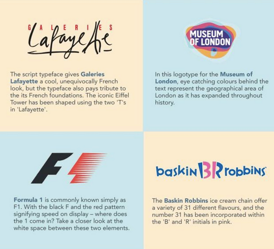
Do you ever wonder why certain brand logos are the way there are? Or why certain icons or strange looking type face are used in a companies logo?
I do.
Brands can and often do spend significant amounts of time, research and money to ensure that their logo's are not only as memorable as possible, but have significance. The fact that the meaning or rationale behind many brand logo's are missed by the standard consumer suggests perhaps that some brands focus a little too much on the (hidden) meaning.
That said, from the obvious to the more mysterious, and the clever to the tacky, below is a great infographic that I first saw on Gizmodo that sheds some light on the often hidden meanings of some of the best well known brand logos out there.
Interesting reading.


No comments:
Post a Comment